 Typography Blog Post #15
Bad Typography Blog 2
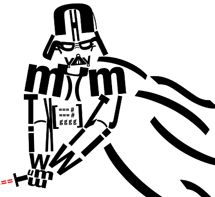
As far as forming objects with type this is a pretty lack luster job. I do appreciate that this person chose star wars as their subject matter however I this person used multiple text to form the object instead of large letters it may have worked a bit better in my opinion. I also feel that if this text was over a gray or slightly dark background it would add a great amount of contrast and help make everything stand out.
No comments:
Post a Comment