MENU DESIGN
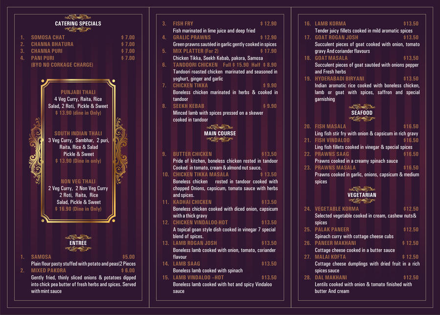
Since we will be doing designs for a Japanese restaurant I figured I might as well look at some deigns that represent formal dining. I like this menu for the most part. I feel that it has a very strong force of organization and is able to separate the items very effectively. This separation is brought around by different colored text as well as a different font all together. Ironically the only things that are bothering me is the color selection. Velvet and gold make me feel like this menu is wearing a monocle and is about to blow smoke in my face from its theoretical cuban cigar. Other than the color selection I feel that this design worked very well.
No comments:
Post a Comment