Wednesday, December 3, 2014

Blog Post #45

Blog Post
Heavy metal band names!

This is a great example of how one should make sure to use a font that is easily read by the general public. with font choice it is important that they are easily read no matter how they are put together. This shows how easy it is to mess up with font choice.

Blog Post #44

Blog Post #44


If you don't cringe at this image then I have absolutely no respect for you as a person. This design implements what you should never do when using type. First of all the "WE" is crushing everything else in the design and the font chosen is blocky and mostly illegible. The spacing between the letters could also be tracked out a bit more in order to seem a bit more readable.

Blog Post #43

Blog Post #43
We're in the T-Shirt business now

Don't worry about the t-shirt as much as the design itself though. Although, it is one fine ass shirt. Anyways this is another example of shaping text in order to portray an image or a specific idea. This artist manipulated the word illusion in order to make the image appear as an optical illusion. A great use of typographic elements.

Blog Post #42

Blog Post #42


Text alignment and how it benefits the greater good. In order to have a good design equal understanding must be present. Whether it is a bad layout or poor font choice, some designs can be lacking. This specific design has used a poor choice by having a pattern background with diagonally placed text laid out over it. Having font placed diagonally can pay off. However it can sometimes be extremely difficult to read depending on the rest of the design.
 

Blog Post #41

Blog Post #41

Typographic Hierarchy

This blog installment will be discussing typographic hierarchy in order to show the importance of certain words or meaning. Concert posters have always been a showcasing of typographic hierarchy and this poster just missed the note. It is important that the most important objects should stand out, whether this is done by changing the font, color, or sizing. This designer correctly changed the size of the font but it looks weird being placed in the middle of the events. There should be a proper display of this where the most important event will be either placed at the top or bottom, not the middle of the flyer/poster.

Blog Post #40

Blog Post #40

This blog post is another inclusion on text manipulation. This form of text has been stretched and manipulated in order to be seen as a heel that is being marketed by a fashion store. Instead of having a physical object they let the text be put in place of that object in order to push the final meaning that there is a shoe sale happening. This is a great use of typographic manipulation and it is a great technique to have once becoming a graphic designer.

Tuesday, December 2, 2014

Blop Post #39

Blog Post #39
Welcome to Whose Font is it Anyway! Where the serifs are made up and the legibility doesn't matter!Font choice is the heart and soul of typography, If there is a bad font in use there can only be bad typography. The main point of font use is to have continuity and legibility throughout the entire design, without this the design fails and its purpose is lost. Make sure to use proper font selection when designing.

BLog l#38

Blog Post #38
Bad Typography 2: Electric Boogaloo

looking at  bad typography is like like watching a remake of a classic movie. You know youre going to have to look at it and its going to be so, so, so, damn painful. In this image displayed it shows how a design can be hurt simply by not adjusting tracking. Tracking pertains to the spacing between the each different part of text flowing horizontally. By failing to adjust the tracking this text is jumbled and illegible at pints. Only you can prevent tracking issues, kids.

BLOG POST # 37

Blog Post #37

While this design is meant to be a parody of what bad designs look like, it is still important to focus on proper alignment and spacing in typographic designs.  Proper spacing is important in design in order to maintain flow and to ensure that the design itself is legible and uniform.  Take this design as as what you shouldn't do. EVER!

Blog Post #36

BLOG POST # 36
Using empty space for the greater good.

While this not the biggest use of negative space, it still shows basic use of this technique. By using shapes instead of actual letters this person used shapes and negative space in order to make it appear that there are letters there. Negative space can be the most powerful tool in a designers arsenal it, and it is important for designers to have a clear understanding of this. Overall this is a very cool use of typography.

Blog Post #35

BLOG POST #35! Were gonna need a bigger font...Get it? No. Okay then.

This poster is a design made by a fan of this film franchise. While this design is extremely simple it still is reminiscent of the move. By using the A in word jaws this designer was able to replicate the classic fin out of water scene. This is an excellent use of typographic skills.

Typography Blog Post #34

Blog Post #34
Bad typography

If you use bad typography you're gonna have a bad time. But seriously, what does this even say? Using fonts Like these is a bad move in pretty much every situation, unless you're trying to make something look weird.

Wednesday, November 12, 2014

Blog Post #33

Blog Post #33

Restaurant menu BANANZA!!!!111!!11!!

For one of my last installations for my menu blogs I wanted to find one that I loved looking at. I would order the shit out of the food on this menu. I dont care if I like, or if it sounds good, this type is calling my name. There is great organization aside from some of the blank space that could have been utilized.  I truly love how the coors repeat themselves multiple times on this menu. It shows a strong amount of continuity. A- Royal Revolver.

Blog post #32

Blog post #32
MENU DESIGN NUMERO DOS!

This is the second installation in my menu design blog posts. Rather than sticking to the conformity of using multiple paged menus, I decided to go for the good ol single page spread. I actually prefer single page menus to multi page menus, its easier to look through and requires no frustrating page flipping. This one page menu utilizes a large amount of different design elements as well as different fonts. Some of the symbols could have been left out with no damage done to the design at all. Overall this was a great showing of how to utilize a small amount of space and fit in a large amount of information.

Blog Post #28

Blog Post #28
FRUIT ART EDITION!!!!1111!!11!???

If you thought typography was limited to paper then get out of the damn room! This person used cut fruit in order to spell the word "Juicy". The only problem I had with this is that it did take my eyes a minute to adjust and figure out exactly what it says.  Cool design but its a bit too crazy for my taste

Blog Post #30

Typography Blog Post #30
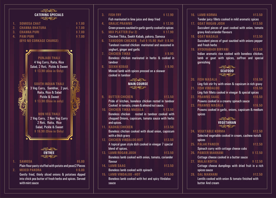
 MENU DESIGN
Since we will be doing designs for a Japanese restaurant I figured I might as well look at some deigns that represent formal dining. I like this menu for the most part. I feel that it has a very strong force of organization and is able to separate the items very effectively. This separation is brought around by different colored text as well as a different font all together. Ironically the only things that are bothering me is the color selection. Velvet and gold make me feel like this menu is wearing a monocle and is about to blow smoke in my face from its theoretical cuban cigar. Other than the color selection I feel that this design worked very well. 

Monday, November 3, 2014

Typography Blog Post 31


Typographic Blog Post 31

I chose to use this image because I felt this designer was able to put a large amount of detail and depth solely using text manipulation. By tilting and using different manipulation methods, this designer was able to pass off a very impressive image. While some of the text could have been changed this is a very impressive use of typograohy.

Monday, October 27, 2014

Typography Blog Post #29

Typography Blog Post #29

I chose to use this image in order to discuss how using different fonts, colors, and sizing can help to create emphasis in a typographic element. By using a bold font in relation to a normal font it can help separate words that are intended to be more important.  In addition to using different fonts or different sizes, using color (especially complementary colors) to separate some words or phrases. Learning how to do this effectively can be a powerful weapon in ones arsenal when using typography.

Monday, October 20, 2014

Blog Post #27

Blog Post #27

I chose to use this piece of typographic art in order to cover how to properly use text to have multiple meaning and elements. This phrase "Ink and water don't mix" is further pushed by you how the designer made it look like the ink is running all over the page, enforcing how these two don't elements don't function together. This is a great example of how to have stand alone text without it feeling alone since there is no picture or design accompanying it.  Unlike in and water, these design elements mix very well. I hope the corniness doesn't make everyone cringe.

Blog post #26

Blog Post #26
MORE LOGOS!!!!

Get your seat belt bucked because he comes part deux of my typographic blog. For this blog post I decided to cover another logo that utilized typographic elements as well as a large amount of empty space. This logo is obviously representing something sandwich related as we can tell by both the name and shape of the black space underneath the text. I really love the use of the rustic font that looks worn in. I also love the use of a simplistic shape to form the sandwich. Overall this is an effective use of simple design that worked out very well.