Saturday, October 11, 2014

Typography Blog Post #15

Typography Blog Post #15
Bad Typography Blog 2

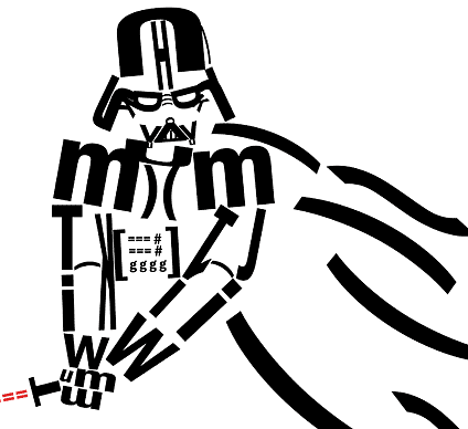
As far as forming objects with type this is a pretty lack luster job. I do appreciate that this person chose star wars as their subject matter however I this person used multiple text to form the object instead of large letters it may have worked a bit better in my opinion. I also feel that if this text was over a gray or slightly dark background it would add a great amount of contrast and help make everything stand out.

Typography Blog #14

Typographic Blog Post#14
Bad Typography

Now that weve gone over some good examples of typography lets go over some of the bad examples. This one looks like its trying a bit too hard. The font that this person made doesnt have any uniform look other than looking goofy as all hell. The change in font size is also very unsettling and confusing..Other than having good contrast I feel that not much is working for this piece.

Typographic Blog Post #13

Typography Blog Post #13
Book Cover Blog Post

I chose this book cover because It shows the use of different layouts as well as different variants of text manipulation. Instead of using traditional text this person chose to use chalk in order to give it a more realistic look. This text also reflects what looks like to be the overall theme of the book. Overall a very nice use of typography and various other design elements. The only other things I would have liked to see was a bit more use of color for contrast.

Typography Blog post #12

Typographic Blog post #12
Book Cover blog

I actually really enjoy this book cover. The text looks like it was haphazardly made with a paintbrush, and I think it was pretty damn successful. The changing font size and the color variation create a nice contrast that separates this cover from many others. The only thing I dont like too much is how the barcode is kind of just thrown in there like some kind of sticker.

Wednesday, October 1, 2014

Blog Post #11

Blog Post#11
Book Cover Blog

I love this book cover. Even though its not overly detailed I find that it uses the content found in the book and reflects that onto the cover and combines it with the text successfully. I have always loved when designers find a new was to use text in order to portray a graphical element and I feel this assigner did a fantastic job in doing so. With the simple yet intricate design I definitely feel that this is an excellent use of typography. I also feel that the bold blocky font helped push the idea of "Industry" one more step forward. 

Blog Pst #10

Blog Post #10
Book cover entry

I like the current typographic styles that are displayed on this cover.  While some may find it jarring to see the words broken up I feel that if used properly it is very effective with moving the eye around the cover and forcing the reader to look at the different pieces of text that are displayed.  I do have a fie problems with this cover though. Since these letters are changed or made out to shapes some of the text is a little bit hard to read. The larger text also does crush the names of the author on the bottom of the cover. Overall I feel that the use of text and white space worked for this design.

Blog Post #9

Blog Post #9
Book cover blogs

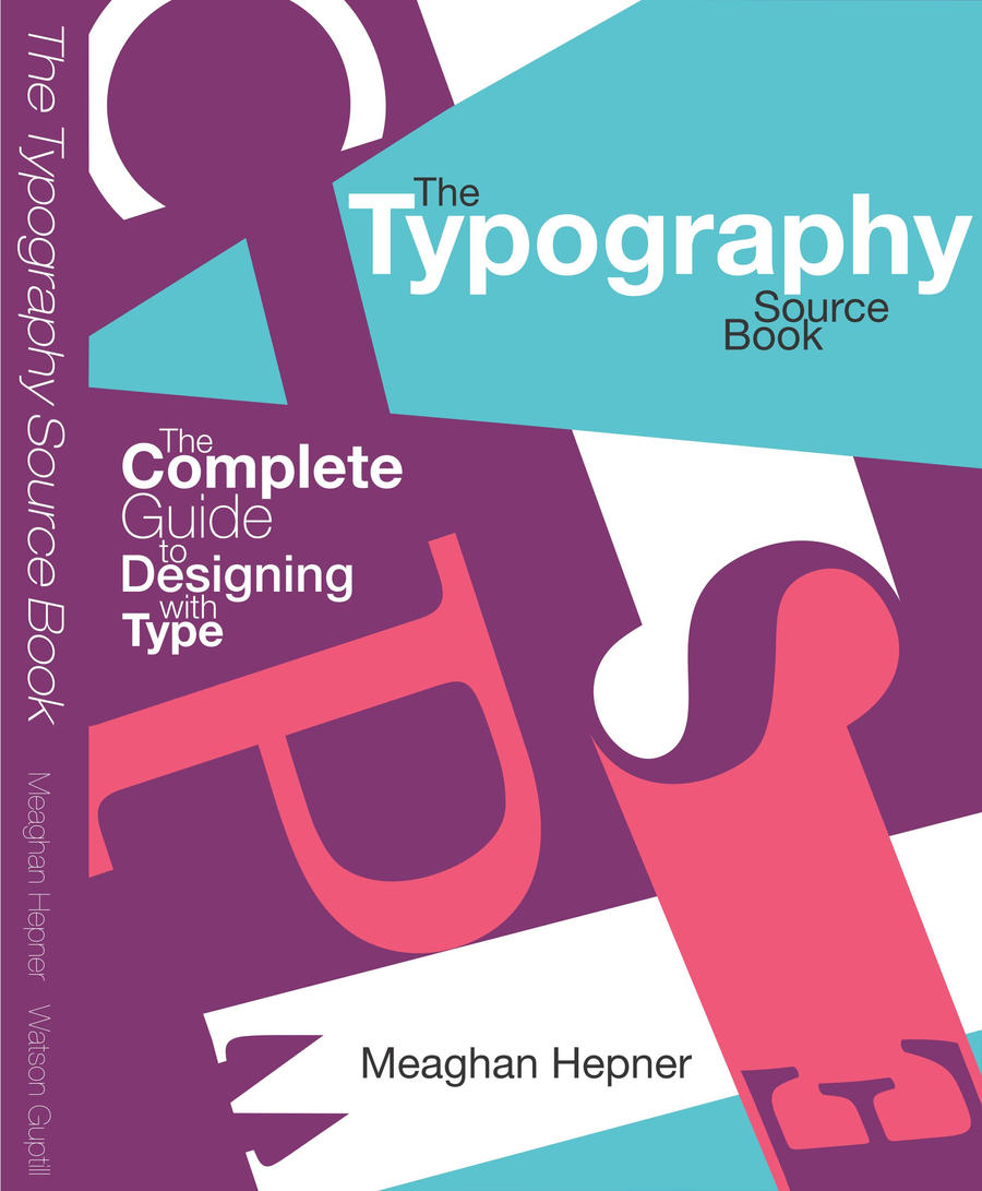
I chose to use this book cover to both poke fun at and critique. As a book cover for a typography tutorial this shows a lack of understanding for text arrangement. The color choice is also a bit distracting to me. Overall I feel that this cover shows what not to do with typography. What is working for me is the font isn't as bad as the rest of the piece in relation to text use.